75. Analyzing results over time
Note
The Trends page is an experimental, under-the-hood feature. For more information on how to enable it, contact Foretellix.
The Trends page provides an overview of key indicators in a test suite, including the VGrade and the failure rate, showing how they have changed over time. It also displays the distribution of scenario failures by category and kind, along with the test runs that experienced the failures.
To open the Trends page:
-
While in your workspace, click on the Trends icon in the sidebar to the left.
-
You can perform the following tasks on the Trends page:
- View the trends for the number of Passing and Failing runs for each test suite run that has been captured into the workspace over time.
- Display overall information about the issues in this test suite.
- Display information about an issue category.
- Display information about an issue kind.
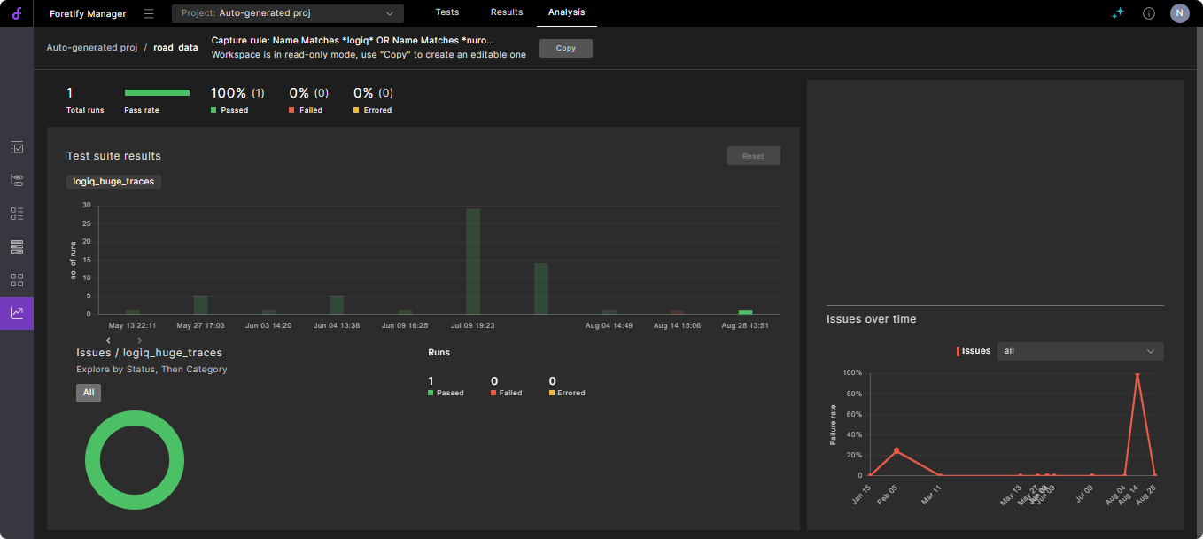
The top left of the Trends page displays the summary Pass and Fail bar chart of the test suites in the workspace. This gives you a high-level view of the progress of your Verification and Validation (V&V) project in terms of the number of runs, number of Passes, and the number of Fails for each test suite.
You can hover over each area of a test suite run bar plot to get more details.
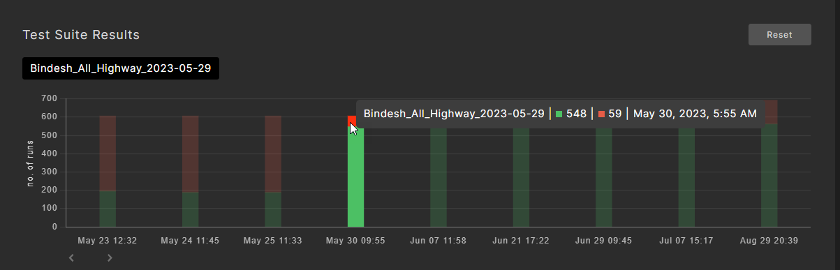
You can display further details in the bottom left by clicking on the bar plot of a test suite run.
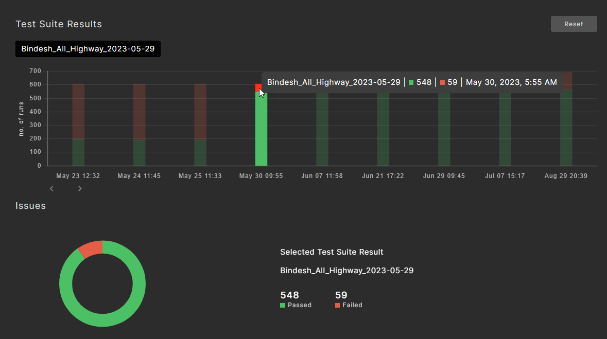
75.1 Display overall information about issues
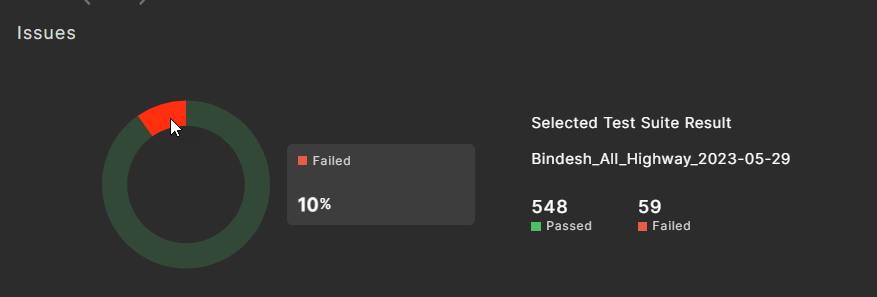
The Issues section on the bottom left shows detailed data for the selected test suite. The doughnut chart shows data on three levels:
- Passed / failed runs
- The issue categories for failed runs
- The issue kinds for the selected category
To display the Failure rate:
Hover the cursor over the red portion of the doughnut.
The Failure rate is shown in a pop-up to the right.
To display the Failure issue categories:
Click on the red portion of the doughnut.
The Failure issue categories are shown in the pop-up.
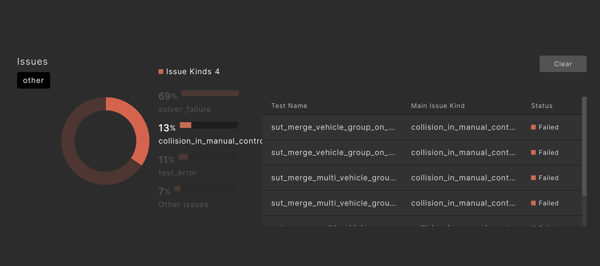
To display the relevant test Runs window:
Click on an issue category in the pop-up.
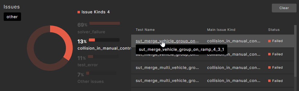
The test runs for the top issue kinds in that category are displayed. You can filter the test runs by toggling different issue kinds.
To see more details and debug a particular displayed run, click on it to view its Run Summary page.
From the Run Summary page, you can click on the Debug Run tab to go to the debug page.
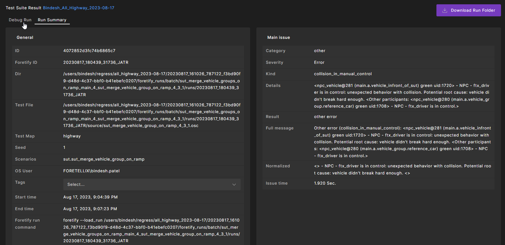
See Debugging a run to learn about the single-run debugger that you can use in Foretify Manager and Foretify.
To reset the section to its initial state:
Click Clear in the issues section.
75.2 Display information about an issue category
The VGrade chart on the top right displays the trends in the VGrade and the failure rate over time.
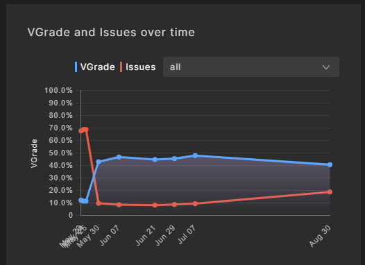
By default, the data for all issue categories is displayed. The x-axis of the chart shows the upload date for that data. The VGrade plot shows the progression of the VGrade over time and provides a high-level view into the progress you are making in meeting your V&V goals as captured in the VPlan.
Note
The VGrade for a particular test suite run will only be displayed after it has been analyzed and evaluated in the VPlan view; otherwise, a grade of 0 is displayed.
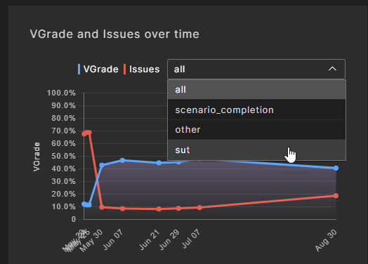
To show the failure rate for a selected issue category:
-
Click the down arrow at the right to display a list of issue categories.
-
Click on the issue category you want to see.
The displayed failure rate plot shows the trends of the selected issue category. You can use this information to get a high-level indication as to how your SUT V&V is progressing.
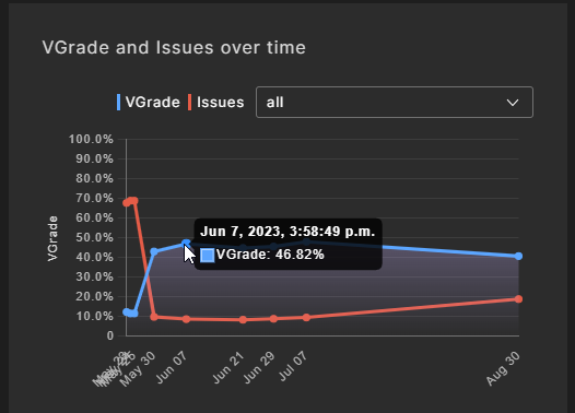
To display the detailed data for a specific date: Hover the cursor over a specific point in the plot line.
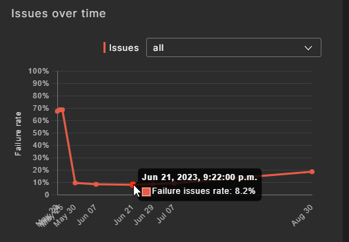
75.3 Display information about an issue kind
The Failure issues rate chart on the bottom right displays the trends in the rate of selected failure kinds over time. By default, the data for all issue categories is displayed. The x-axis of the chart shows the upload date for that data.
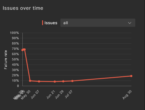
To show the failure rate for a selected issue kind:
-
Click the down arrow at the right to display a list of issue kinds.
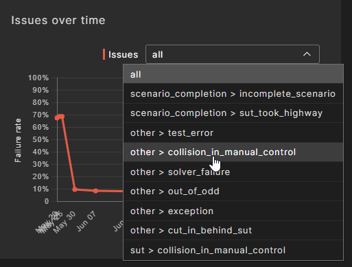
-
Click on the kind you want to see.
The displayed failure rate plot shows the trends of the selected kind. You can use this information to get a high-level indication as to how your SUT V&V is progressing as it pertains to the selected issue kind.
To display the detailed data for a specific date: Hover the cursor over a specific point in the plot line.